
(01) Branding & Graphic Design · Case study
Bloom Dental Spa: A dental identity that feels like a deep breath.
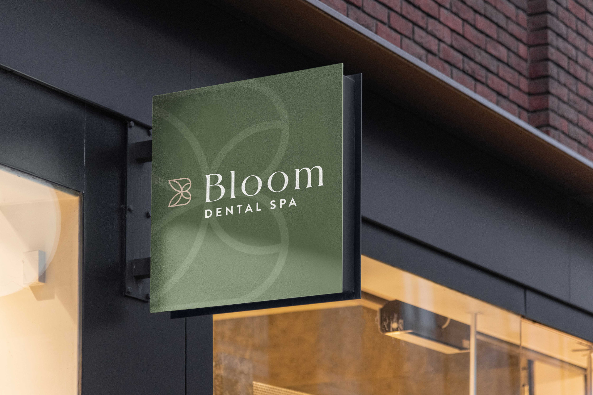
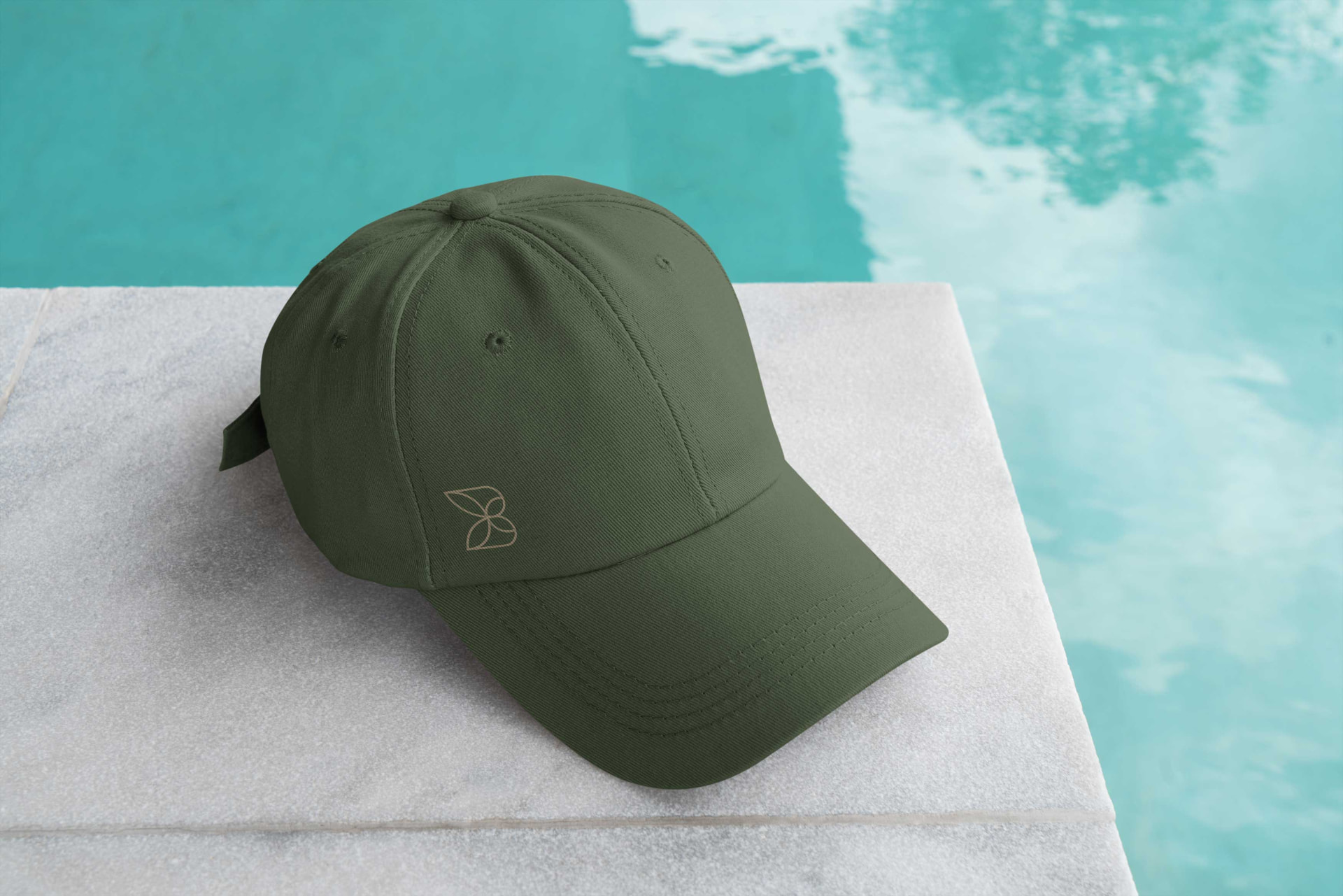
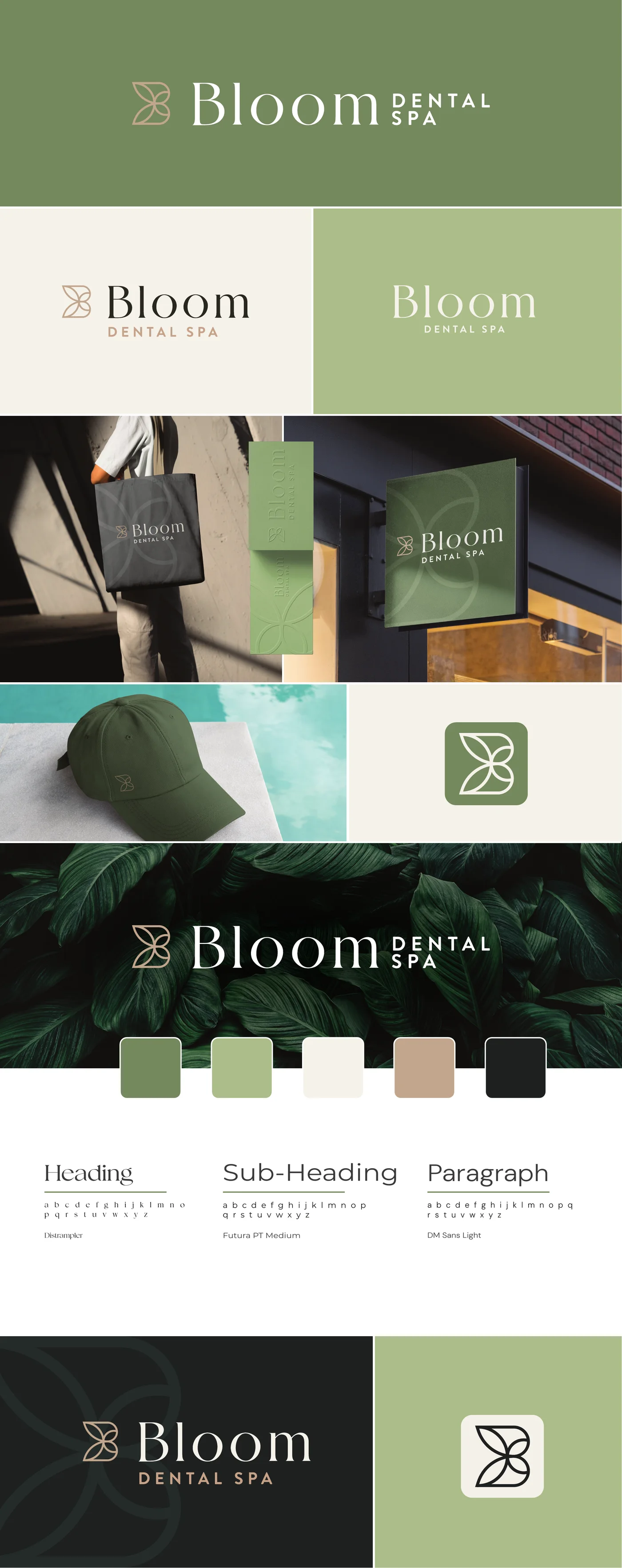
We built Bloom Dental Spa a calm, spa-inspired brand, from the leaf-petal monogram to the sign out front, so patients feel at ease before they ever sit in the chair.
- Client
- Bloom Dental Spa
- Industry
- Dental & wellness
- Location
- Brantford, ON
- Scope
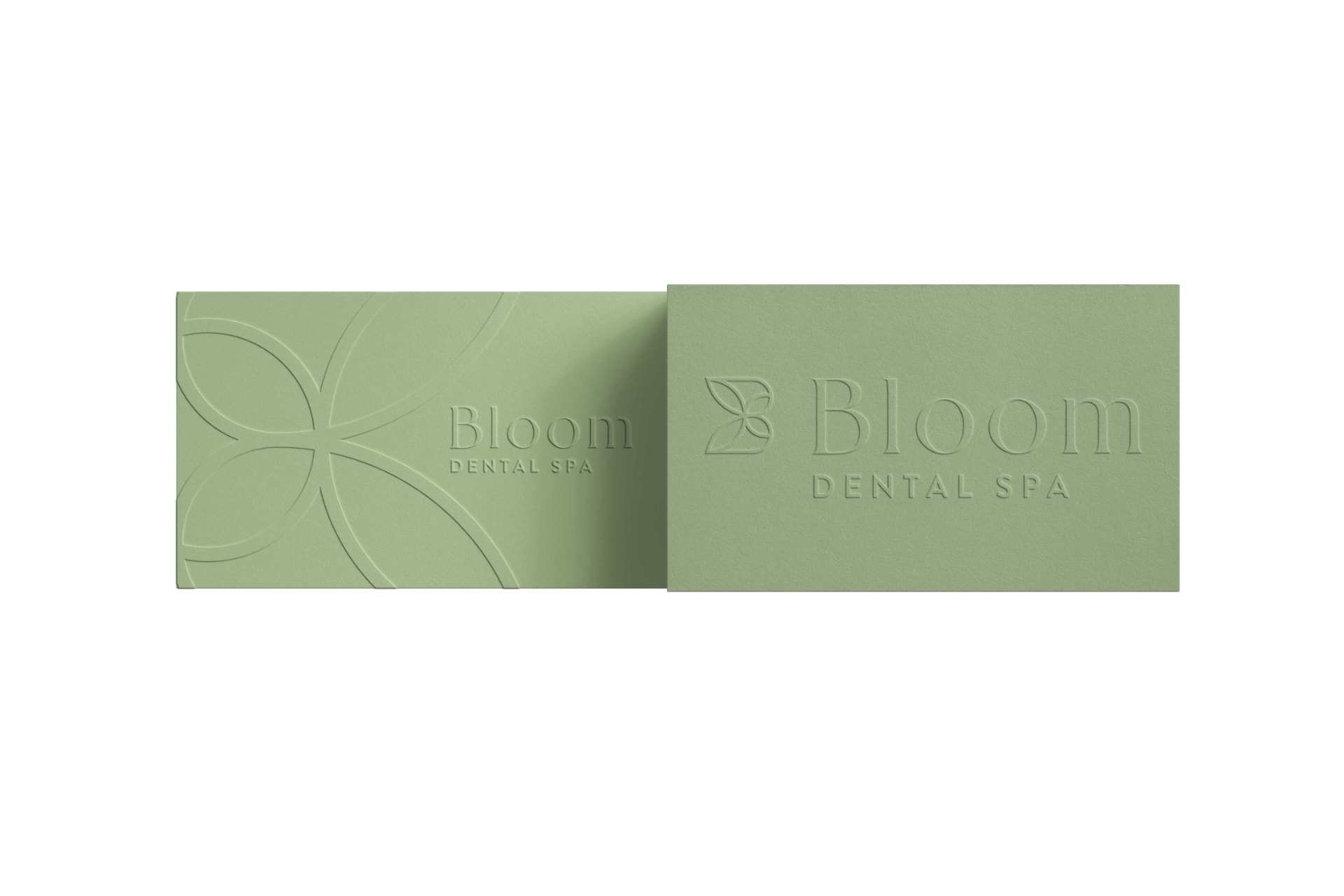
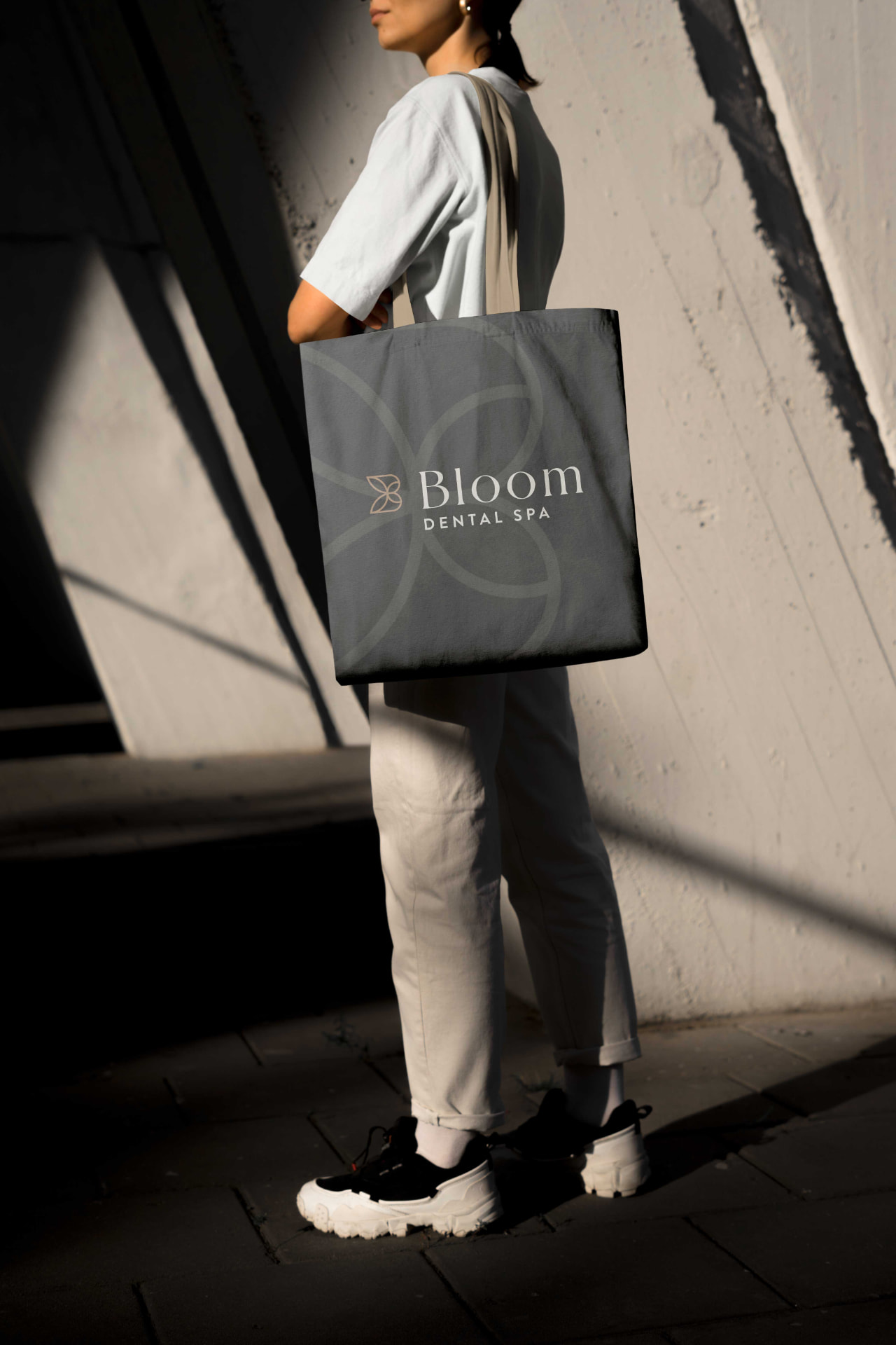
- Identity, print, signage, merchandise
The Challenge
Where they were
The practice was growing beyond its original name and look. Like most dental offices, it risked feeling clinical, and clinical feels stressful for nervous patients.
What they needed
Create a brand that says spa, not surgery: warm, confident and memorable, and flexible enough to work on everything from a business card to a storefront.

Our Approach
A mark with meaning
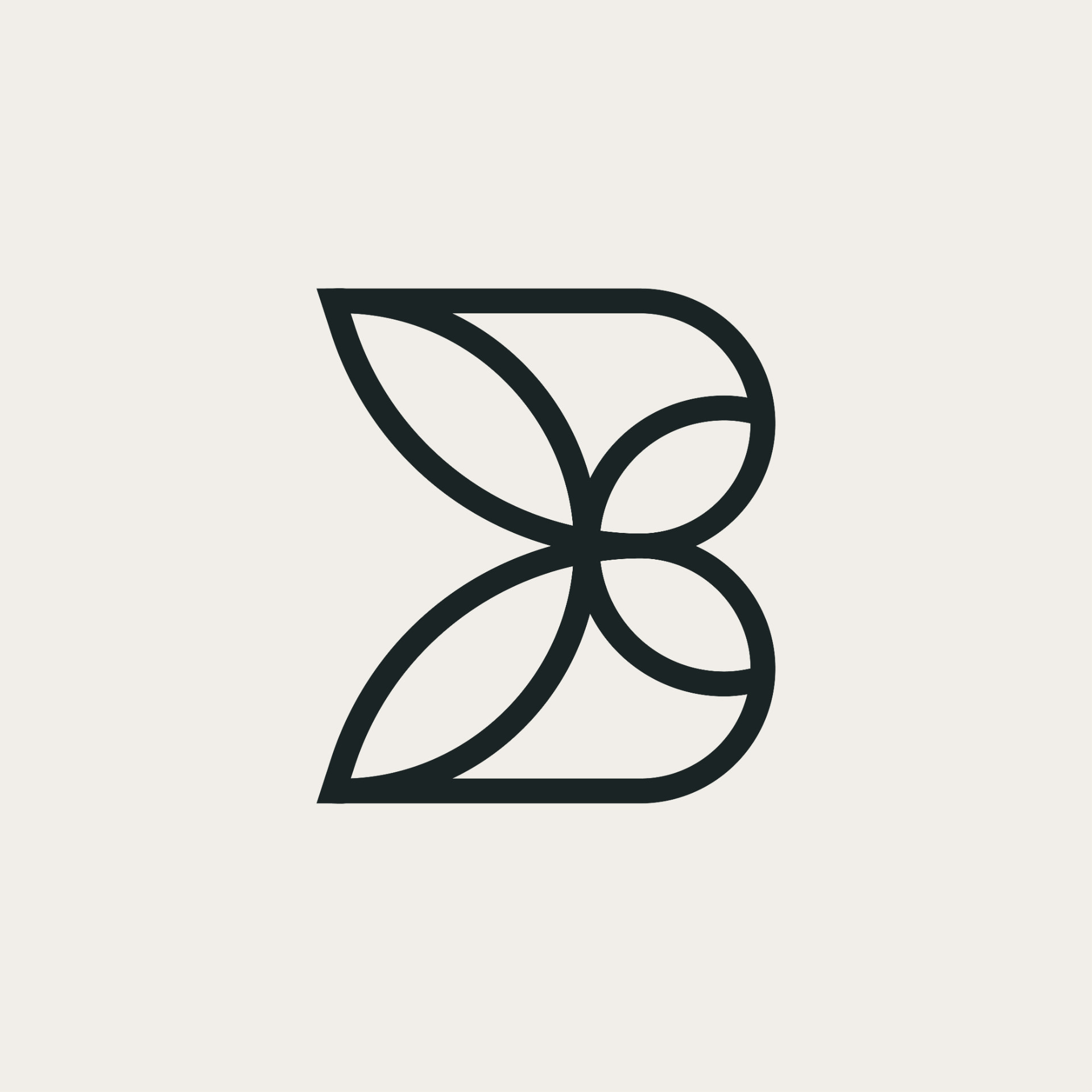
Four soft petals come together to form a B, a quiet symbol of growth and care that works at any size.
A calming palette
Sage and forest greens, warm cream, charcoal and a champagne accent, chosen to feel natural and restful.
Refined type
An elegant serif for the name, paired with clean, widely spaced capitals that keep everything easy to read.
The Work

The Result
One recognizable look across the sign, cards, bags and apparel
A brand that feels welcoming to nervous and first-time patients
Print-ready files and guidelines the team can use with confidence